[BEFORE & AFTER] PARADISE VALLEY BACHELOR PAD
 Today I am sharing with you part one, the living room and kitchen of a house I just wrapped in Paradise Valley Arizona. I think you'll be quite surprised at the transformation. My client lives in an unassuming house on an unassuming street.
A typical man, the look of his surrounding weren't important to him. Many of his hobbies live outside the home: hunting, driving race cars, and flying planes occupy his weekends. As long as he had a comfortable seat, a large tv, and somewhere to put his beer he was happy as a clam.

After living in his home for many years, he was ready to make some improvements to it. He was an extremely easy client and really trusted my opinion and decisions. There were only two points of contention: the countertop material & the sofas. More on that later.

This was a small remodel and job with the main focus on the remodel of the kitchen and bathroom. A manly minimalist, he doesn't want or need a lot of stuff. He stressed to me that he likes his space dark & cave-like. So I choose a dark grey-blue for the walls. When the painter started putting the color on the walls, my client called me concerned it was too dark (almost black!). I told him to let the painter finish the room and then tell me what he thought. He loves it. It is Benjamin Moore Stormy Sky.

Then warm leather sofas, which was my most difficult task on this project. Everyone has their own ideas on what is worthwhile to spend money on and to this particular client, the sofa was a disposable item. If I had my way, it would have been a cognac-colored leather Belgian slope arm sofa. If he'd have his way, he would have had a Lazy-Boy with a recliner. But it was his house and we were already knee-deep in it.

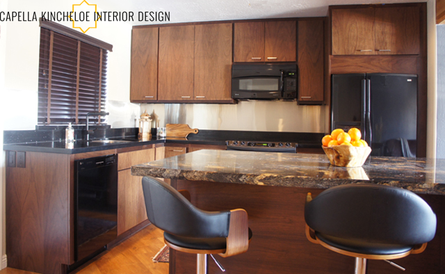
This was also a lesson in balance, because my client wanted dark everywhere, but if you have dark floors, dark cabinets, & dark walls there is no balance and balance is so important to a well-designed space. So I choose BM Alaskan Skies for the walls in the kitchen. This helps really set off the pretty wood grain and countertops.

My client is a tall man so the counters were raised to 36" and I had the cabinets go to the ceiling. I don't like a lonely cabinet, so I eliminated the cabinets on the window wall. We kept the black fridge and dishwasher and replaced the range & microwave and added a beverage cooler. Keeping with the black, we used a black faucet and then went stainless steel on the backsplash. A bit of the industrial edge.
What do you think of that lovely dropped ceiling in the before picture? Love the fluorescent lighting. In the new kitchen there is under counter led lighting for the bar and under cabinet led lighting that is dimmable for all sorts of moods.

Now, the countertops. I had originally wanted black quartz. I love black quartz countertops. Quartz is a great, hardy material and I think it looks great in a kitchen - plus it doesn't show dirt and food. I also used it in this project. When we went to check out slabs and materials my client fell in love with a very expensive granite and wanted it everywhere. You can read about my feelings on granite in this post. He would have gotten his way if there wasn't a slab shortage and only enough to do the island. So we compromised again, black quartz on the perimeter and the granite on the island.


So what else do you want to know about this project?
Stay tuned for Part Two of this project on Monday - the bedroom & bathroom.